Bright and Dark Colours is part of the research project Visual Worlds II. It is said that dark colours feel heavy and bright colours light. In this experiment, we explored this idea.
—> Slutrapport Visuella Världar II (In Swedish)
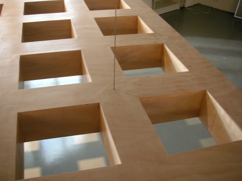
The raft is suspended by a wire and appears to float in space. The brain has parallel visual systems to recognise objects and to enable spatial action. The visual perception is usually simple and straightforward. Recognising objects and identifying their possible use, weight and point of gravity rarely pose any problems. The raft, however, perplexes the parallel visual systems. It takes time to comprehend the situation. What is the platform for, why does it appear to hover freely, and where is its point of gravity?
—> Slutrapport Visuella Världar II (In Swedish)

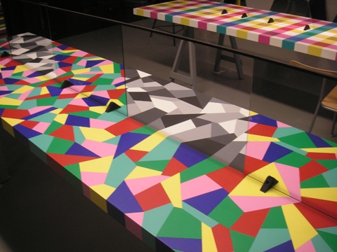
The mirrors on the tables give an illusion of transparency. The impression of transparency is a fairly common phenomenon in the modern world of glass and plastic, but it was perhaps less common in our more primordial surroundings. There are “natural” transparencies, however, for instance, ice, water or cobwebs. The illuminated peep-cabinets demonstrate how transparencies can be created.
1. An unexpected encounter between a rubber duck and a brain
2. Meeting at a table
If you are two people, we suggest you sit down opposite each other by one of the mirrors. Try to position yourself so that your body or face overlap those of the person opposite. If you manage, you may get an unusual experience involving a moment of confusion. Perhaps you will have mixed feelings about seeing your own familiar face meet and mix with that of another person. Read more about faces later on.
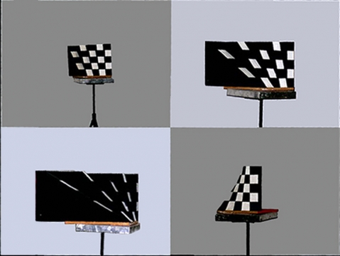
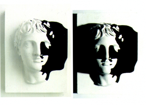
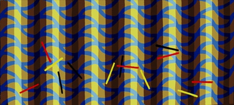
3. Looking into a black and white world
We can influence our seeing with our will and intention within limits. It is interesting to think about these limits and how they may be built into the architecture of our visual systems. For instance, we probably can’t turn the world into black and white instead of colour through sheer willpower. Nor are there any optic filters that would make this possible. We can, of course, achieve a grey-scale by lowering the lighting so that we only see with our rods (< 1 candela). Then the world looks grey, but we also lose focus.
In this experiment, we can look at a pattern through the gaps in the mirrors and experience it as though through a “grey-scale filter”.
—> Slutrapport Visuella Världar II (In Swedish)


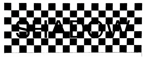
Blacker than black. The letters on this sign are carved out and the black is formed by the darkened void behind. When the sign is illuminated by sharp light from the side, the contrast between the black and white squares appears constant. The contrast between the black letters and the surrounding white area, however, appears to increase as the light brightens. Our sensory perception is tuned to comparisons. There are rarely any absolute measurements for our experiences. What looks black in one context appears more grey in another. Our visual perception covers a fantastic range of contrasts but nevertheless has its limits. Slight contrasts, for instance, may grow imperceptible when a strong contrast is added to the picture. The reason for this is the way in which the brain and the eye process information. Our visual worlds are always a form of incredibly well-balanced compromise.
—> Slutrapport Visuella Världar II (In Swedish)
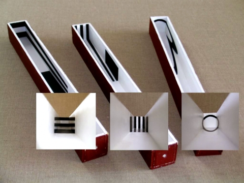
In this project, we experiment with both life-size and miniature models. These miniature peep cabinets help us to discover unexpected spatial relationships, with regard to both colour and light.
—> Slutrapport Visuella Världar II (In Swedish)


The thing you look at moves and changes – We have a tradition of studying colour contrasts by painting different colour combinations on two-dimensional surfaces. These peep cabinets can complement such studies with the possibility to study colour contrasts and light and shade in a changing spatial context. One of the starting points for this is the artist and colour theorist Josef Albers’ works on colour contrasts. While Albers focused mainly on two-dimensional pictures, my concrete visualisation of contrast phenomena in the illuminated cabinets is based on actual spatial conditions. The illuminated peep cabinets are mounted on swivelling stands and can be rotated. The colour and light that changes as they are aimed in different directions should be looked at through the peep-hole.
It is not the colour phenomena in themselves that are interesting, but the revelation and discovery of colour combinations and spatial relationships, in the manner of an artist studying a subject.
The most beautiful colours appear in the aimed parallel daylight on a cloudy day, but the experiment can also be carried out using artificial sources of light or a combination of daylight and artificial light. In this way, we can study how colour appears in different kinds of light.
—> Slutrapport Visuella Världar II (In Swedish)


There are countless ways of seeing the world, and it would be exciting if we for a moment could see it through another person’s eyes.
When you follow someone else’s eye movements registering different parts of a picture, it is like borrowing a piece of that person’s visual world. The best thing would perhaps be to study in film sequences how that person’s gaze moves across an image. Exciting and sometimes surprising.
Today, it is relatively easy to follow another person’s gaze using eye movement cameras, as they look at a work of art or some other interesting object. It is also possible to register people’s eye movements in other situations, such as when driving a car, reading or watching a movie.
The technology for studying eye movements has been around for quite long, since the mid-1900s, but today it is much more user-friendly.
Films showing how different people read works of art was shown at the Visual Worlds exhibition at Konstfack, Stockholm. Below you can get an idea of what it involved. In the stills, the red or pale areas show the zones that a group of people gaze at the most. These pictures are far less interesting, however than following a person’s gaze in real life.
Seeing how others see helps us look at the world in different ways. This became clear to Gösta Wessel, who often lectures on pictures:
I had been using a painting by Bonnard in many of my lectures. A model in a room. This is a wonderful illustration of how a painter depicts back-lighting. When I watched filmed sequences to see how others looked at the picture, I discovered that they often looked at a small area in the upper left-hand corner. Then I discovered something that had escaped my notice until then. There is a mirror there, reflecting part of the model.
An intentional focus on light and colour can alter one’s vision in a way so that what may be perceived as essential suddenly grows unimportant. There is a concept in cognitive psychology called inattentive blindness, which is exactly the phenomenon Wessel experienced. There are many other examples in scientific literature.
Many thanks to Daniel Lundqvist who filmed the eye movements and took the eye movement photographs.
—> Slutrapport Visuella Världar II (In Swedish)


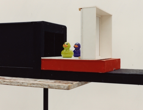
Your eyes move. Your right eye sees a green duck, and your left eye sees a violet duck. Can you make them merge into a green/violet duck?
When our eyes are presented with two slightly disparate images, we are usually able to consolidate them into one single image, where the discrepancy between the two images is experienced as depth. Since the eyes are set slightly apart, that is usually how we perceive the world. Either eye usually has a slightly different picture of the world, except when we look into the far distance.
The brain merges these pictures (the resulting product is useful, in the form of stereo vision). When the eyes perceive two images that differ too much from each other, the brain is unable to merge them. Instead, the perception may alternate between the two images. This is called binocular rivalry.
The image with the greatest contrasts will be visible the longest. A moving image, moreover, will dominate strongly. When it comes to colours, it is not as obvious which colour will dominate. Which duck dominates your vision? Or are you able to combine them into a green/violet duck?
Another fascinating question is if you are able to alternate between the ducks at will. Can your frontal lobes govern what takes place early on in the visual process?
—> Slutrapport Visuella Världar II (In Swedish)


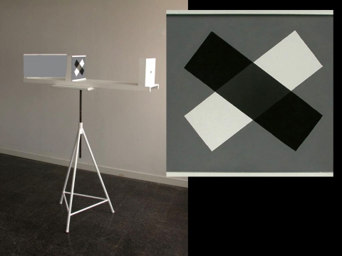
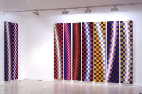
You move. The impression of this sculpture is entirely dependent on the position from which you are viewing it. From one position, you may perceive the sculpture as a black-and-white chequered surface. (The exact position depends on how tall you are.)
As you move, you see another shape. The sculpture cancels what is called formal constancy, that is, the fact that the world normally appears stable even if we move around in it. Our capacity to perceive the world as constant and stable is truly fantastic and unparalleled. Creating a constant picture of the world puts many demands on the visual system, and this becomes especially clear when we try to construct a constant vision in technical systems, e.g. Robots.
—> Slutrapport Visuella Världar II (In Swedish)

A coloured surface is dramatically changed by the colour of the light that illuminates it. Similar colours stand out and shine while dissimilar ones eclipse. You make night-time so much fun demonstrates how this interaction between coloured surfaces and coloured light can alter our perception of space.
In one static room, the changes of the light create three radically different spaces: one expanding, one contracting and one defining. The viewer’s position is the only thing actually moving.
In collaboration with Mårten Wessel.


Södra Länken (The Southern Link) is a road system that connects sections of Stockholm’s closest southern suburbs. The road system is approximately 6 km long, 4.5 km of which are in tunnels. The ambition of The Swedish Road Administration (Vägverket) was to make Södra Länken the first known example of a large tunnel project that prioritised the need for light, orientation and aesthetics.
Three architectural offices were asked to submit sketches/plans for the interior design of the tunnels. One requirement was that each project group include someone with artistic competence. Art should be essential to the work from the beginning and not be added later as decoration. Gösta Wessel was part of the team from White Architects, who produced the proposal that would constitute the basis for the design of the tunnels. The objective was summarized as: Light – Overview and Variation. It dealt with light and large scale themes.
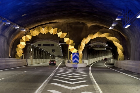
In a later stage, four artists were given the assignment of artistically giving form to a number of tunnel exit halls. Gösta Wessel designed two such halls. In one, there are two arches constructed of cast concrete blocks and covered with mosaic from shattered yellow glazed ceramic tiles. On the other stands, a twisted-column covered in the same manner. These forms give the large caves their own identity and atmosphere, understood both head-ons and from the corner of the eye when quickly passed by. The experience of light is fundamental.


Form of Life is a moving sculpture in front of the office building of Astra Zeneca in Södertälje, Sweden. The shape is clean and straightforward. It is slowly rotating and depicts an organic movement reminiscent of a dancing human being. It acts as a landmark when approaching the industrial area. The sculpture was made out of polyester reinforced with glass fibre. Lomar Architects, Stockholm designed the building


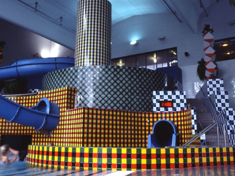
Eriksdalsbadet is Stockholm’s largest public bath with a section called the ”adventure bath”. Different patterns were created out of floor tiles in bright colours. Spotlights with a range of different coloured lights were mounted on pillars around the pool, making the colours stronger. On two pillars there are spotlights with red and green filters. These are programmed to change colour randomly. The red-green-yellow-black pattern changes in different coloured lights. In green light dark horizontal lines appear and in red light dark vertical lines appear.


From Order to Chaos. This was a further development of the floor pattern used at Södra Station. The pattern consists of five shapes, of which one is a square. The pattern can make both a symmetrically organised form and a form that never repeats itself.


There are many studies showing how quickly people notice and react to threatening facial expressions. This unconscious and rapid interpretation probably take place in the amygdala located inside the temples on either side of the head. These structures get information from the eyes directly via the thalamus, which means that the emotional interpretation begins within a hundredth of a second after something is registered by the eye. Higher systems in the frontal lobes get the visual information much later, around two-tenths of a second. By that time, the information has already been processed fairly thoroughly and can form the basis for a more balanced action, such as holding back an irrelevant emotional reaction. Recent studies indicate that the amygdala can react to both positive and negative emotional stimuli. This also includes learned, genetically programmed or expected reactions of fear.
—> Slutrapport Visuella Världar II (In Swedish)


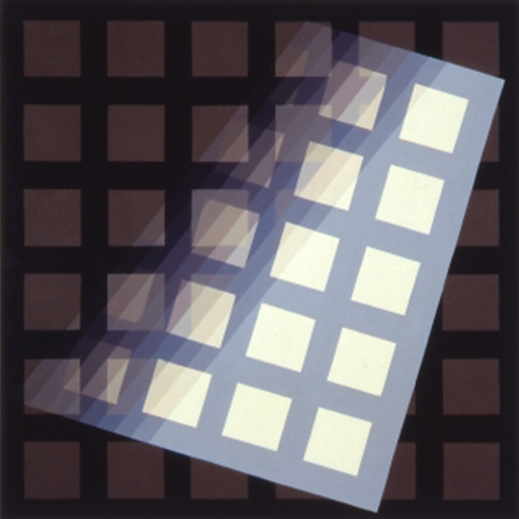
Ceiling and a floor for The Swedish Pavillion at the World Exhibition in Seville. The theme was ’the inspiration of light’. The project explored the interaction between coloured light and surface colours. The ceiling was painted in a pattern that consisted of the physical basic colours red – green – blue as well as black and white. Circle bows of cyan and yellow cut the pattern. The circle bows have their centre point about 60 meters outside the building. The ceiling could be lit with a spotlight and dichromatic filters in red — green — blue with the same spectral curves as the painted colours.
With red light, all the green coloured become black. In green light, all the red surfaces become black, in blue light the yellow bow becomes like a black shadow etc. By changing the coloured lighting totally different patterns appeared.
I created 20 different images, programmed into a computer, that repeated in a six-minute sequence from nightfall until morning throughout the six months of the exhibition.
The building is now situated in Grythyttan and houses The Restaurant Academy.


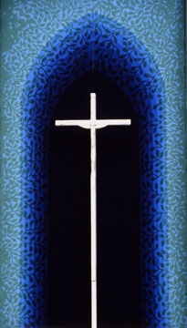
The altarpiece, The Bower of Virgin Mary — the New Paradise is placed in Mariakyrkan, Fyllinge. In collaboration with Kajsa Mattas.
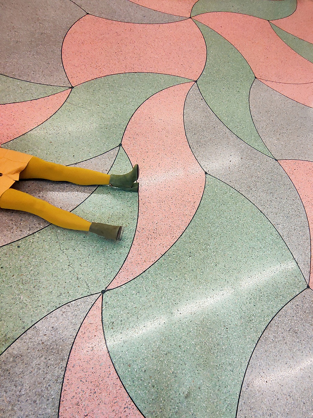
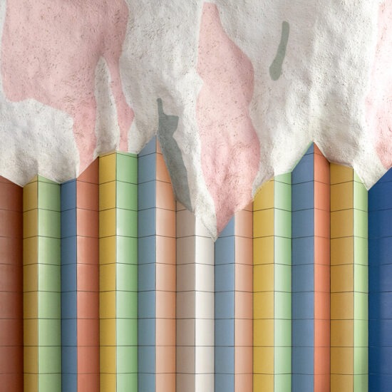
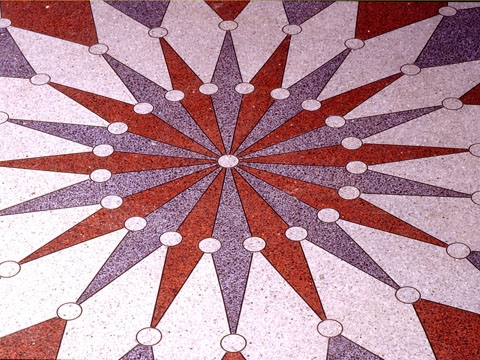
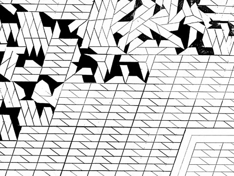
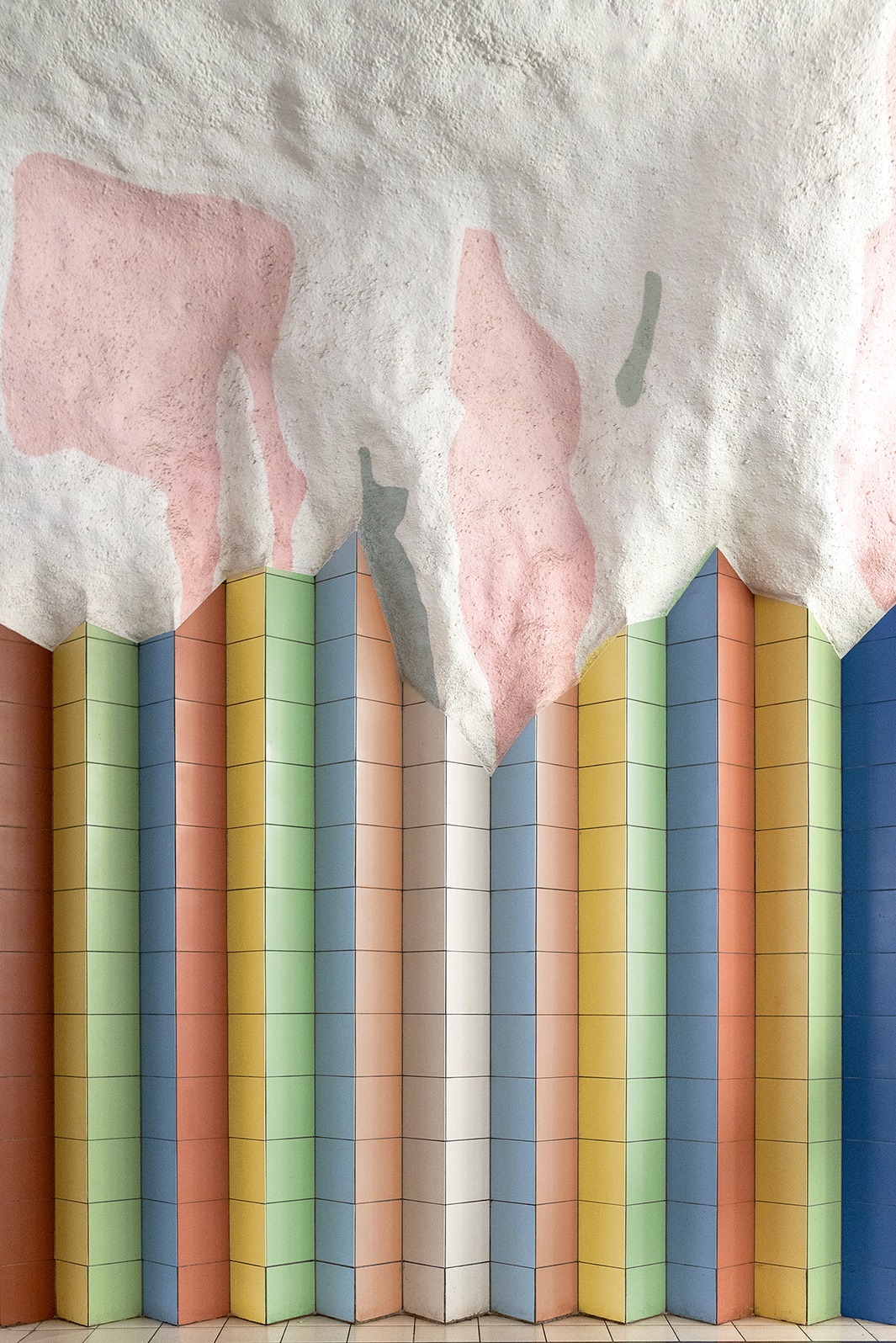
The assignment was to design the entire space surrounding the station created when Södra Station (the Southern Station) was decked over. I worked with the room created by the pillars placed throughout the station and the colouring of the surfaces that were covered with tiles. I constructed a waving pattern which never repeats itself to make it exciting to move through the approximately 5000 square meters of the station. The pattern is made out of two shapes based upon the angles of The Golden Section. The material is terrazzo, and the colours (pink, green, and grey) are light to make the floor reflect light from above. When light reflects off of the floor these colours blend to create a warm yellowish light. Photo credits: © Tekla Severin (image 1–4)


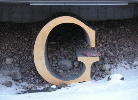
Playful sculptural representations of the nine letters in the name of the station. A game using shapes and materials, with concrete, pebbles, granite, polished stone, sand, glass, mirrors, gold, marble, rusty iron, stainless steel and rails used by Stockholm Transport. In collaboration with Leif Bolter, Veine Johansson and Inga Modén
—
A. Mirrors and granite
X. Rails used by Stockholm Transport.
E. Concrete, pebbles and polished stone
L. Hand-painted marble on polyester
S. Sand and polyester
B. Concrete and silicate-paint
E. Glass and mirrors
R. Iron ore, iron and stainless steel
G. Concrete and gold


Levels, surfaces, plants, pillars and a sculpture. The expression is made to associate to nature and vegetation on rocks. The cracks on the rocks look different in different landscapes and reveal the rock’s hidden crystalline geometry. In this case, the hidden geometry has its roots in the golden section.


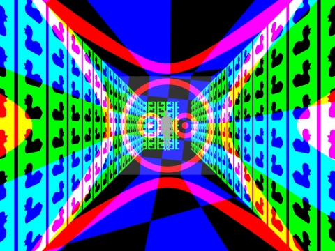
Illusionary perspective images in a system of corridors for Danderyd gymnasium (high school). The viewer’s position and movements change the visual experience of the shapes painted on the walls, floor, and ceiling. In one corridor you see a circle from one side, and another shape from the other side. In another corridor, the floor appears to be checkered from one side, but not from the other.


Our intention was to give the curtain the appearance of volume. The flat curtain was made of printed velvet with applications of shiny silk. The colour and pattern of these applications create the illusion of three dimensions and light.


Mörby Centrum is the end station of the subway’s northern line in Stockholm. Gösta Wessel and Karin Ek were commissioned to design the entire space. The blown-out mountain room was showered with concrete and plastered white. Spotlights were placed on one side of the tunnel (being the only source of light). The shadow that appeared on the irregular walls were painted grey. In the same way, the spotlight was placed at the other end of the room, and those shadows were painted pink. The result of this process was a room that appeared grey and white from one side and pink and white from the other. And when the viewer moves forward at the station both grey and pink shadow figures appear. Both the viewer’s position and movement change the visual experience of the room. Photo credits: © Tekla Severin (image 1+2)